In our previous blog, SAP RAP Programming: Building Your First OData Service we built a Simple report using SAP RAP and understood about OData Metadata. In this blog we will design our User Interface of the Fiori screen to make it more presentable and easy to understand.
Using UI Annotations in CDS for Fiori App Design
In SAP RAP programming, building a user-friendly and consistent SAP Fiori app starts with how data is presented. However this is where UI annotations in CDS views come into play. These annotations allow developers to define the layout, behavior, and semantics of the user interface directly in the backend—making the frontend development smoother and more reusable.
This blog explores how to use UI annotations in Core Data Services (CDS) to configure the look and feel of Fiori apps, and how metadata extensions help separate UI logic from data definitions.
SAP RAP – What Are UI Annotations in CDS?
UI annotations are metadata tags added to CDS views that describe how data should be displayed in a user interface. These annotations are:
- Technology-independent: They work across different UI frameworks.
- Reusable: One OData service can serve multiple applications without redefining UI logic.
- Centralized: UI behavior is defined in the backend, reducing frontend configuration.
Benefits of Using UI Annotations
- Consistency across multiple apps
- Reduced development effort for frontend teams
- Improved maintainability by separating UI logic from application code
- Device-independent presentation for desktop, tablet, and mobile
So now lets continue from where we left off.
User Interface Design Using Annotations SAP RAP
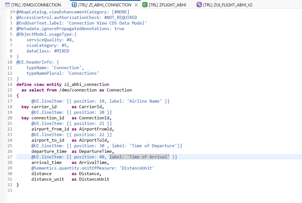
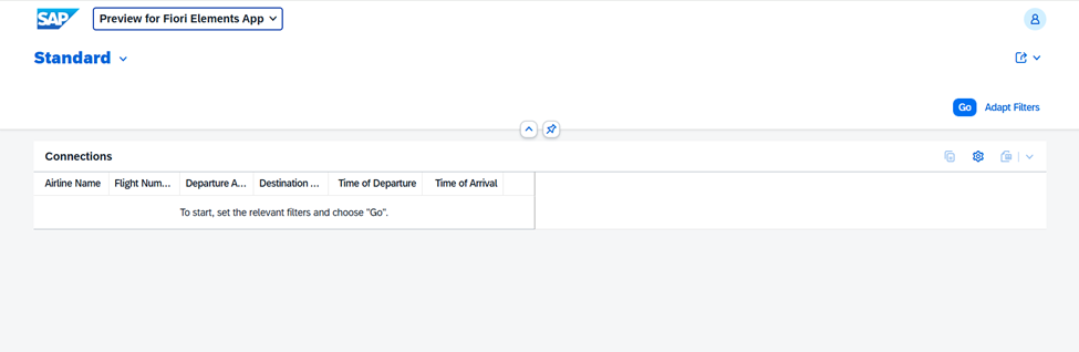
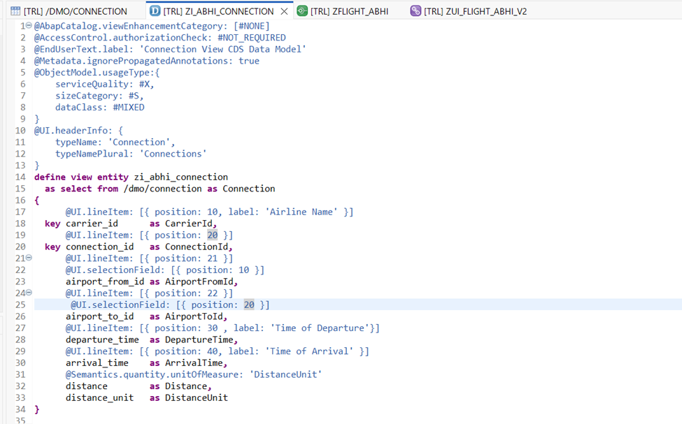
Till now we have developed our CDS view which looks like below.
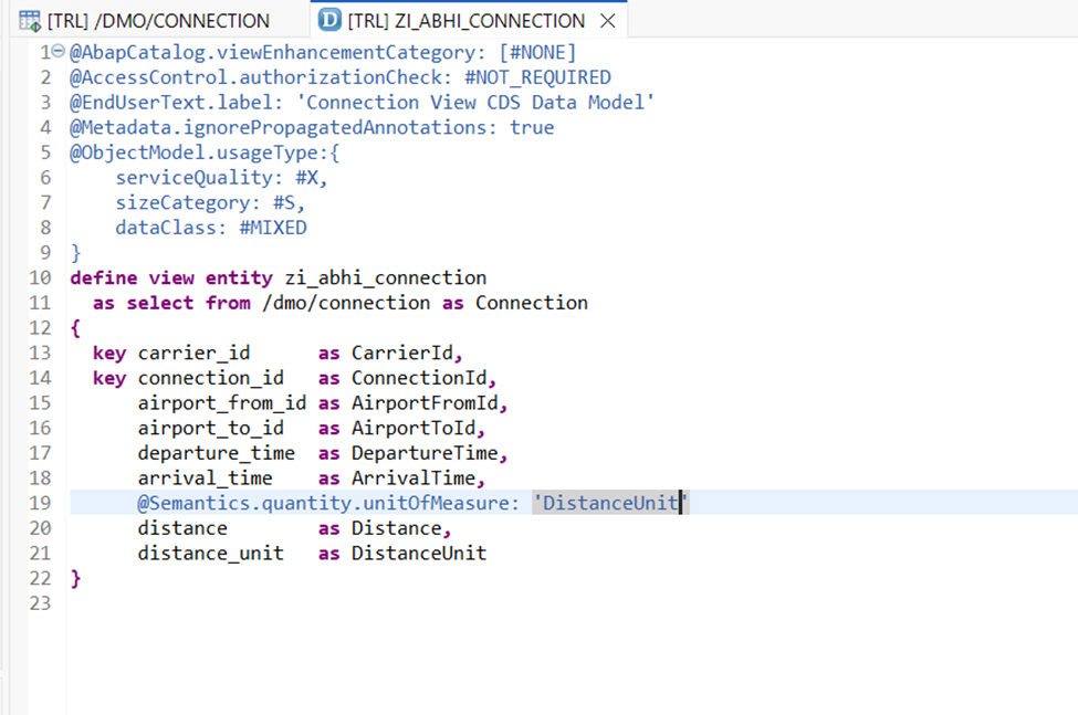
Now we will add a header to our application screen. For this we will be using @UI.headerInfo annotations.
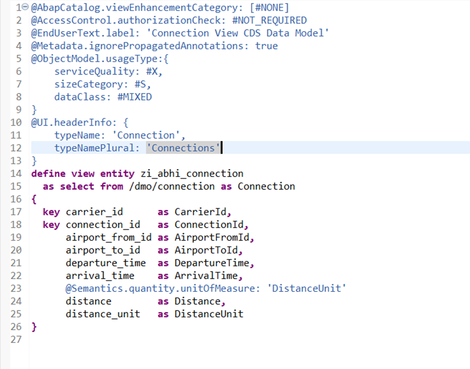
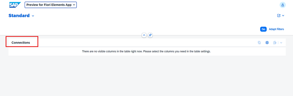
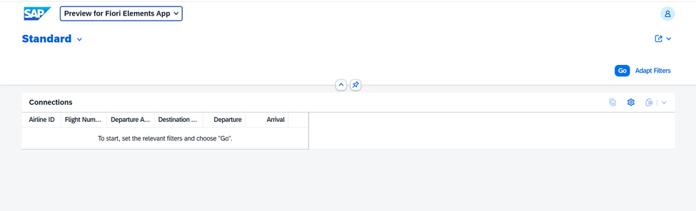
Activate and reload our application to check the header.
Note because this is a header of page and not any line item it is written outside define view statements.
Now lets try to add Columns by default in our list report. For this we will use @UI.lineItem annotations.
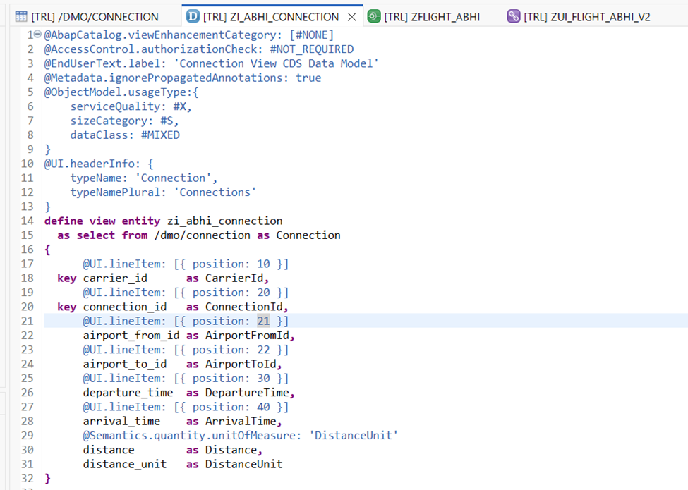
Furthermore, in each of these annotations there are multiple properties which we can leverage. For now we will only stick with the most relevant ones for our requirements.
As the name suggests position will specify the sequence in which columns are placed on screen. Also note that it need not be a multiple of 10 and can also be any other number (like we have provided 21 for Airport From).
Activate and reload the application.
But wait where are these column heading coming from and can we change these?
The answer is Yes but first lets check where are these headings coming from.
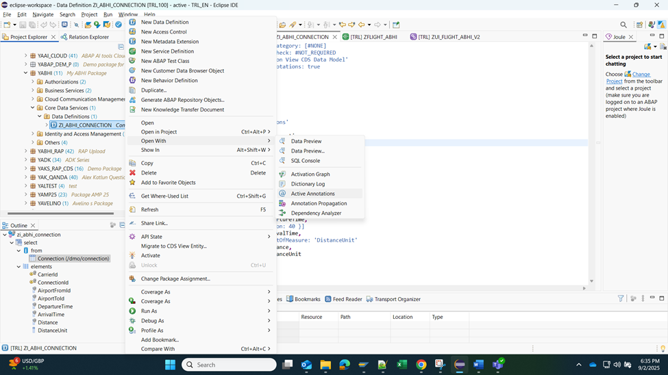
Right click on your Data Definition and Open with Active annotations.
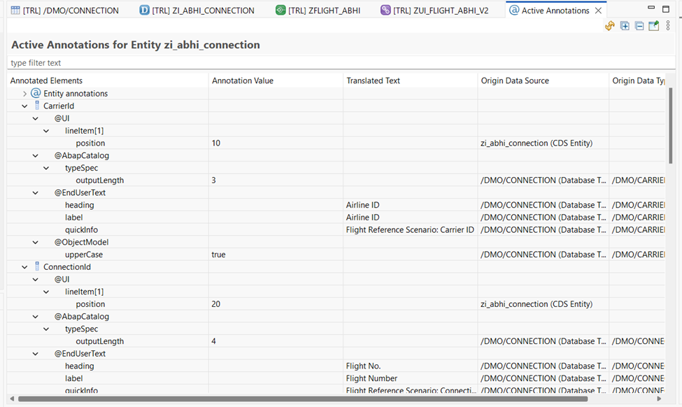
Here we see that the End User text heading and label are coming from the source table data element.
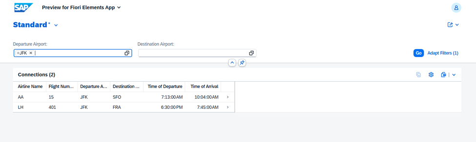
Additionally, now lets try to change the label of our columns using the label property of line item annotation.
Activate and reload the application.
Next, now lets add some filters or selections on our screen. We will try to utilize @UI.selectionField annotation for this case.
Activate and reload the application.
In our next step we will add a line item or object page to this application.